 |
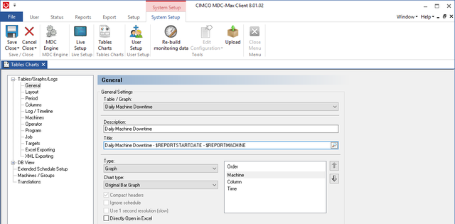
There is often a requirement to put more than one column of data on a graph, for example machine stoppage reason codes. To do this copy the Hourly utilization graph we just created and edit the description and title to reflect that this is to be a downtime graph.
|
Go to the columns menu and for each machine downtime reason timer add a column, put in the relevant title and use the HMS format.
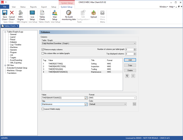 |
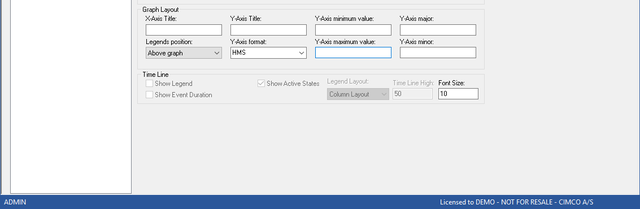
The arrow buttons by the Column 1-4 marker let you add more columns of data. On the layout menu change the Y-Axis format to HMS and delete the Y- Axis maximum value
 |
On the Targets menu disable the targets, and the result should resemble the following:
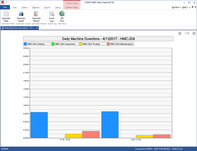 |
The Y axis is set automatically to the largest value on any of the graphs in the group.